The single most important factor that impacts your website’s success is planning. So we’ve developed a framework (with a downloadable template at the end) to help make your next web project a success.
You’ve probably put a lot of time and money into your website’s design. The colors are vibrant, your logo looks fantastic, and it’s full of beautiful imagery. But it’s still not delivering the results you want.
Could your website copy be to blame?
Web users have notoriously short attention spans, which means if they don’t find what they’re looking for quickly, they’ll leave without a second thought. Are you turning customers away without even realizing it? Check out these 7 signs you need help with copywriting to find out.
13 years ago, the Philadelphia Eagles faced off against the New England Patriots in the Super Bowl. Many things have changed since 2005 – web design is one of them.
Your website can be a powerful tool to generate leads for your business – if you use it correctly. Unfortunately, many businesses don’t optimize their websites to convert leads. The result: missed opportunities and missed sales. Here are a few ways to effectively generate leads with your website design – and some pitfalls to avoid.
With so much data available, how do you know what to measure? Focus on these meaningful metrics to see how well your website is working, not vanity metrics.
Every business today needs to have a good website design in order to succeed online and in the physical world. The design of your website plays a huge role in how users view your business.
You may have heard from different web designers about what you should and shouldn’t do with your website. Here are our top web design myths to clear the air and help your site succeed!
With the first quarter coming to a close, it’s clear that the industry experts were correct in suggesting data and analytics will drive the industry in 2017. Not only do marketers have more access to compelling data than ever before, they also have tools to analyze it, interpret it, and put it to use.
One of the most useful data gathering and aggregating tools is called a “heatmap.” A heatmap shows how visitors interact with a webpage: where they look, what they click on, and how they scroll. The red or “hot” areas of the map represent the greatest amount of activity.
Heatmaps provide real-time information to marketers seeking to respond to industry changes and trends as quickly as possible, making it easier for the customer to find what they’re looking for and eventually convert to a sale.
Here are just a few ways heatmaps can help you optimize your website design and improve conversions.
1. Identify where users become confused
One of the most common sources of confusion on a website is the navigation bar. After all, this is where a user is intuitively trained, for better or worse, to look seek out information (hence its name). If a visitor to your website is spending a lot of time hovering around the navigation bar, it’s reasonable to assume that they’re not sure where to click. They are confused.
While there are a variety of factors that result in nav-bar confusion, a few are very common. Perhaps it contains too much information to digest, it’s unnecessarily cluttered, the text is too small to read, or drop-down menus are difficult to click.
According to some case studies, removing the navigation bar all together is the key to greater success. Consider the type of information your user is looking for—is the navigation bar necessary to lead them there, or would a simple call to action suffice?
2. Test your calls to action
What if your CTAs simply aren’t generating clicks? A heatmap will show you if users are noticing your CTA buttons, if they’re hovering over or near them before making an action, and what action they’re likeliest to take afterward.
In the example below, you’ll see that the landing page was optimized with an effective call to action. The heatmap shows how the CTA button clearly receives the most attention on the page.
Furthermore, a “click map,” featured in most heatmapping software, can show you whether your CTAs are actually generating clicks, and if those clicks result in additional actions. A click without a form-fill is, however, just a click!
The bottom line is that calling a visitor to action doesn’t amount to much if the visitor doesn’t click. (We discuss this in our upcoming Conversion Marketing Seminar.) Split-testing your CTAs is critical when you’re trying to determine their effectiveness. Placement, color, text, size, and many other factors can make the difference between a strong call to action and a weak one.
3. Discover which parts of your Web Design should be optimized
We’re in an age of rapid change, and yesterday’s tools are no longer adequate to engage consumers and drive conversions. In a sense this means your website design should be adapting to the viewer on a moment-to-moment basis.
Such intuitive web content is of course difficult to create and maintain on the fly. What you can do, however, is use heatmapping to determine the parts of your site that can be optimized. This is known as conversion rate optimization, or CRO.
This allows you to challenge conventional wisdom and see what works best for your visitors. Should the most important information appear above the fold? (Maybe not!) What’s causing visitors to abandon their shopping carts? How do numbers trigger the likelihood of a purchase?
When you use heatmaps to answer questions like these, you no longer need to rely on anecdotal data, or even the hard data of other businesses. Your customer is your customer, and your job is to cater to their needs, not the people visiting another website.
Want to learn more about how to design and optimize your business’s website? Check out our business web design guide!
Web design is a job that requires a wealth of creativity, logistical know-how, and perseverance. Thankfully, the designers and developers know how to make the most of their talents and share what they know with others in the industry in ways that can turn even the most beginner user into a pro.
This is a collection compiled with the help of our designers and developers, to highlight what we love about website design and where we go to get the latest on trends, tips, tutorials, and inspiration.
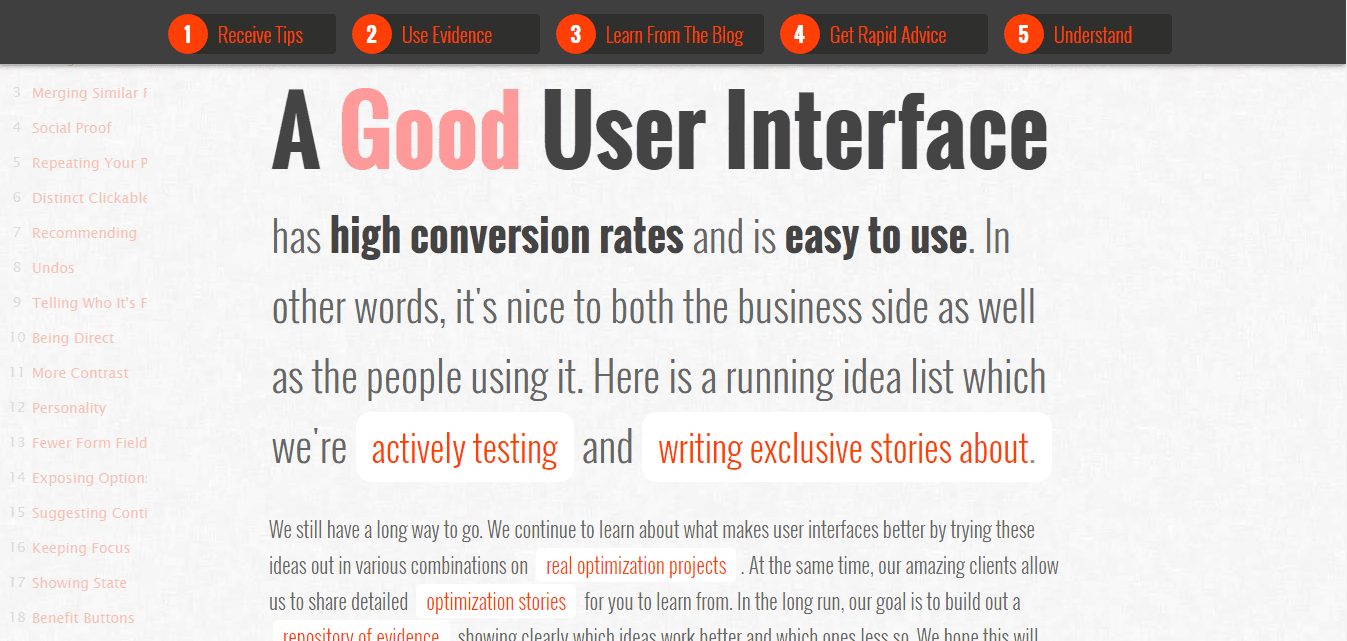
1. Good UI
Good UI is a great example of a site that practices what it preaches. Exploring the blog for a few moments will reveal that it does exactly what its name implies: demonstrates good UI design and practices. The fluid, stream-of-conscious-like format makes their collection of ideas easy to get through without sacrificing quality or information.
The simple layout keeps the focus on the content which is geared toward ideas for great UI design, and both the sidebar and counter make it easy to keep tabs on your progress as you read through the blog.
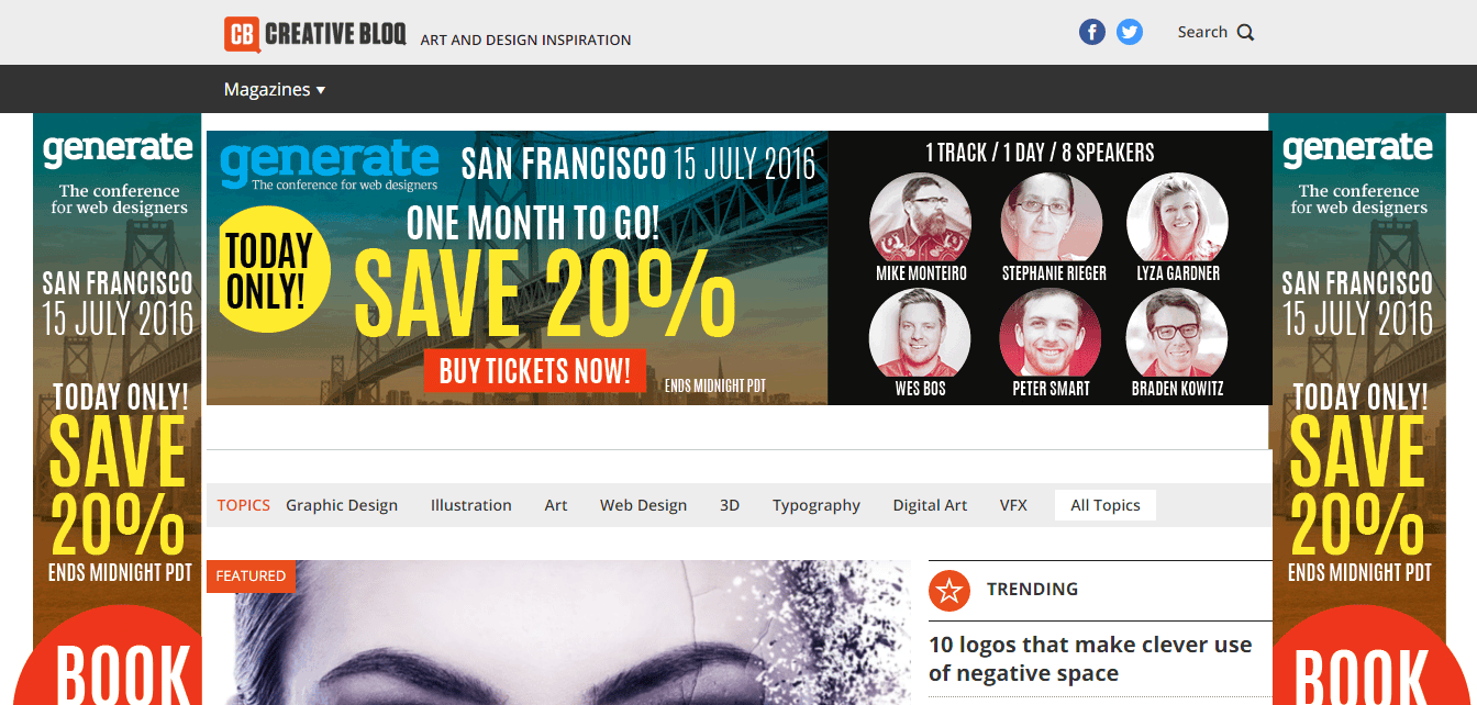
Creative Bloq is a favorite among designers, and for good reason. This site takes creative and inspirational approaches to all matters of design, from web, graphic, and 3D design, to digital art, typography, and VFX. It delivers this great content on a daily basis to keep its audience up to date on all the latest trends and techniques in the industry.
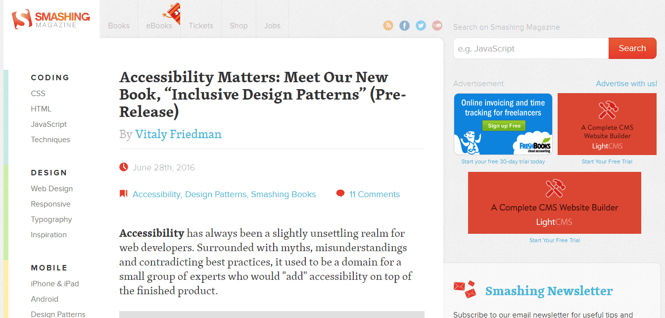
This magazine is arguably one of the most popular design and development blogs out there right now. Its quality over quantity approach has earns more than its fair share of bookmarks, along with its attention to the latest web design trends, techniques, and technologies.
Smashing Magazine’s blog is a wealth of free resources and expertise, but if that’s not enough, you can also purchase their books (physical and digital) for even more empowering design knowledge.
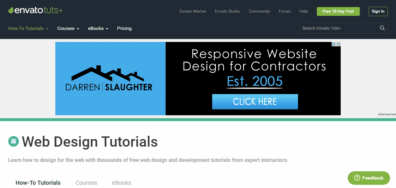
Tuts+ places focus on hands-on learning to engage beginner and skilled designers alike by supplying them with actionable lessons and study guides. This kind of learning helps them apply their existing creative skills to areas including photography, coding, web design, and illustration.
The real treat to using Tuts+ is that it lets you go through tutorials at your own pace. The breadth of tutorials and topics gives users the chance to explore myriad skills related to their creative digital interests.
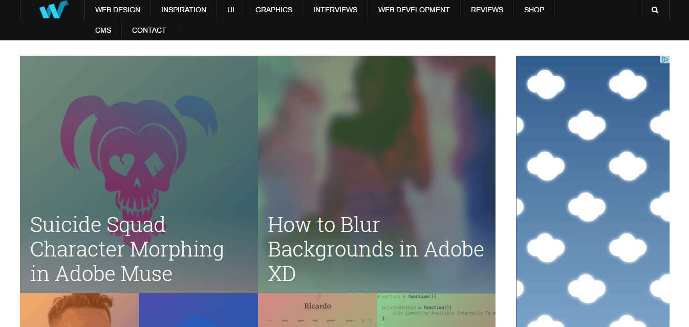
Web Design Ledger is very much a ‘for and by’ web designers project. This site is all about helping others to share their experiences, useful resources like tutorials and tips, inspiration, and knowledge on all things design.
Besides being a platform intent on sharing the best of the best in terms of web and mobile design, its blog is updated several times daily with fresh and interesting content.
This design magazine sprang from humble beginnings as a personal freelance web design site, but has since become a go-to blog where designers can find resources, tutorials, and inspirational ideas for all areas of website design.
They cover web and mobile app design from all levels, and delve into some of the latest web trends and technologies.
The creative folks over at Happy Cog created Cognition as an outlet for all their musings on anything digital, from design and coding to their experiences. They’ve written content centered around dozens of topics, including UX, front-end development, design, project management, and even client services.
They take a candid, if not sometimes eclectic approach to these topics that provide not only invaluable insight into the design process, but shed light on the human components of developing websites from the ground up.
If you’re interested in checking out some of the latest and greatest talent in the web design and development industries, give Awwwards a look. This site not only takes the time to recognize and promote up-and-coming designers, but it also features a host of trending tips and tutorials, along with other great freebies within the Awwwards blog.
Abduzeedo is all about inspiration and visuals to keep the creative designers creative. The design blog collects helpful how-to’s and visual inspiration daily for its users. They even utilize case studies and quick-tips to promote the benefits of tutorials and the software they’re designed for.
Abduzeedo covers topics including photography, typography, and logo design; but it also features interviews and ‘sites of the week’ as well.
Last but not least, A List Apart is an online publication that started way back in 1998 and caters to any and all people who make websites. They explore what it means to design and develop websites, including the meaning of web content and the standards/practices that define good web content.
If you aren’t already subscribed to or follow the sites on this list, give them a try; and if you follow any web design and development blogs that we forgot to mention, let us know in the comments section below.
When it comes to your business’s web presence, you probably think about how people interact with your website. You may even consider how you show up in Google since they dominate the search engines, but even Google’s search engine market share is declining year after year. In reality, your web presence is so much more than either of these.
Website vs web presence
Your website presence is the one place where your consumers can come to learn information about you and connect with you. This includes your website design and your blog.
Your web presence is the collection of all of the places online where consumers are able to research information about your brand and engage with you. These include social media profiles, review sites, directory listings, microsites, and anywhere else online where your brand is mentioned or profiled.
Importance of search engine presence
As of February of 2016, comScore reports that Google holds 64% of the market and NetMarketShare claims 67% market share when it comes to desktop searches.
comScore
NetMarketShare
It’s always important to have an organic SEO marketing and content marketing strategy so that your content, products, and services are showing up to solve people’s search queries.
When it comes to mobile, more and more people are performing mobile and tablet searches than desktop. This is why it’s more important than ever, and always will be, that your website is mobile-friendly.
Just like you should track Bing and Yahoo along with Google, you should also track mobile rankings for these search engines – which we do for our clients.
In the big picture of the Internet, search engines aren’t everything – there is still something missing.
How social media plays a role in web presence
YouTube, Facebook, Twitter – all of these sites are beginning to account for the decline of Google’s search engine market share. Instead of focusing all of your attention on just your Google search engine rankings, maybe it’s time to see how your business and content is displaying on these search engines.
When it comes to Facebook, you can search right inside the mobile app to find content, never having to leave the app to view the content. This trend will continue, which will hurt website analytics because you are getting visitors from “dark social” that you aren’t able to track on your website.
In terms of displaying ads, you might think that Google is the place to be for mobile ad displays. But you’d be wrong.
According to IHS, Facebook has about 47% ownership of mobile display ad revenue worldwide, while Google comes in at under 24%.
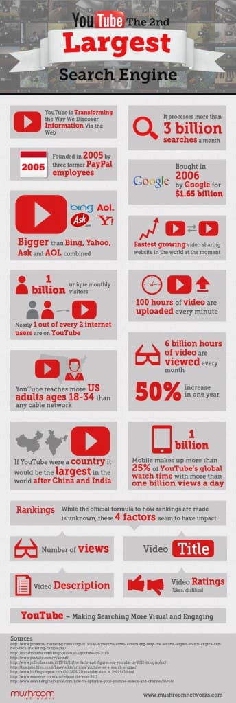
YouTube is considered to be the second biggest search engine there is, with over three billion searches a month and growing.
With YouTube videos showing up on the first page of almost every search result, it’s about time you start creating high quality videos and using them in your marketing strategy.
Future of social media and customer service
A lot of people like to engage with brands through social media, whether they are praising the brand, have a question, or want to make a complaint. Yet about 70% of customer complaints on Twitter are ignored by brands. Because of this, consumers are trying to find a different way to get in touch with businesses.
So, how do brands get more conversational and personal with their customers to handle any questions, comments, and complaints they have quickly and easily?
Social media messaging.
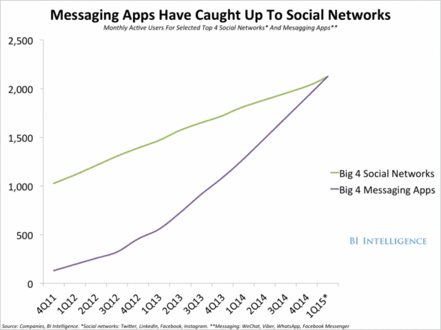
According to a study done by Business Insider, the big four messaging apps (WhatsApp, Facebook Messenger, WeChat, and Viber) have taken over the big four social networks (Twitter, LinkedIn, Facebook, and Instagram) in terms of active users. With the growing popularity of Snapchat, social messaging activity is sure to continue to outpace active users on social networks unless they figure out a way to engage just as quickly, easily, and privately with their consumers.
Not only should you have an active presence on social media sites, but brands need to also be active on these social messaging apps as their customers are clearly favoring them when trying to converse with companies.
Consumers reviewing your business
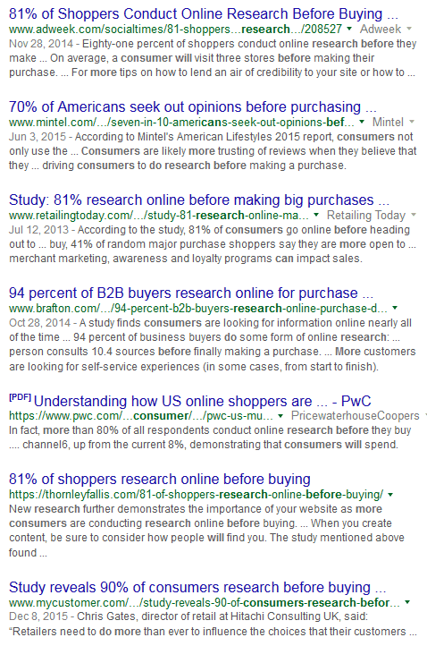
When performing a Google search about a restaurant, hotel, or other business, you will notice that review sites pop up near the top. Consumers are doing more and more research before buying because of all the content that they can review. Multiple studies have shown that 70-90% of consumers are doing online research before making a buying decision.
Consumers are researching on sites like Yelp, Angie’s List, Foursquare, Amazon, and Google Business for reviews before determining where they should give you their money.
When you have a good presence on all of these sites and you’re getting good reviews from the most loyal brand evangelists, sometimes your customers still need to be gently nudged or asked to leave a review.
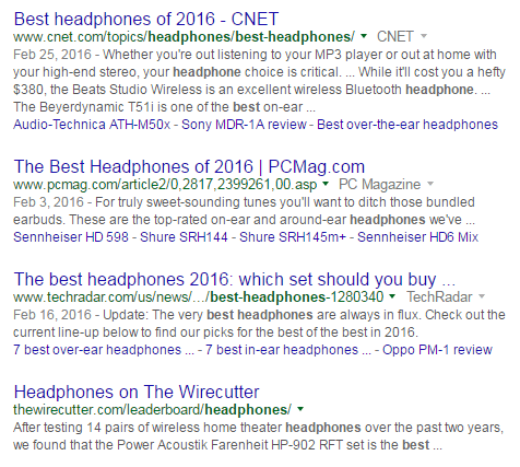
Content is ranking higher than products and services
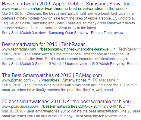
Organic search results have changed and will continue to change, so we must adapt. Fewer products and services are showing up, with more articles and blog posts taking their place. Years ago, an SEO marketing mindset would want to rank their product pages for search terms like best smartwatch, affordable car, best headphones, and more. What’s showing up now aren’t products – it’s articles and blog posts that provide helpful content to the user in their research phase (after you get passed the paid search results, of course).
Notice that Apple does not rank at the top for “best smartwatch” (but it does show up as the top paid result).
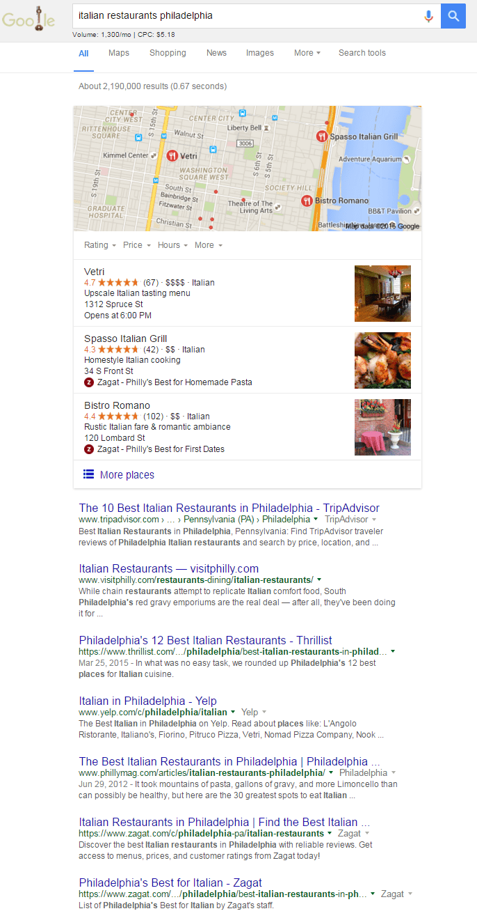
If you are searching for a restaurant or hotel, Google returns maps, reviews, and travel sites. You have to get to the second or third page until you find a site owned by the restaurant or hotel.
Are you getting your business listed on these review sites? Your competition is, and so should you.
Claiming listings and niche directories
Whether you’ve moved business locations or your directory listings have never been in sync, having a consistent Name, Address and Phone Number (also known as NAP) is very important for your online business. If you have inconsistencies, even just spelling out “West” versus “W.” in some cases, can mean you won’t be showing up in map results that Google is pulling from directory listing sites.
There are many benefits of claiming your directory listings, so it’s extremely important to have a consistent NAP across all of your listings. It’s also important to be listed in listings relevant to your industry and niche as well.
If you are a local business then you need to have a presence on Yelp, Foursquare, and Thumbtack.
For lawyers, you need to be on FindLaw, Avvo, and Lawyers.com. When you look at just about any city search for lawyers, they are on the first page.
Finally, if you sell eCommerce products, look into selling on Etsy, Amazon, and eBay. The chances of beating out competitors for buyer keywords is slim without having to pay for it.
More branded searches
Getting more and more organic traffic from relevant keywords to your business is great. Getting more and more organic traffic from branded relevant keywords is even better.
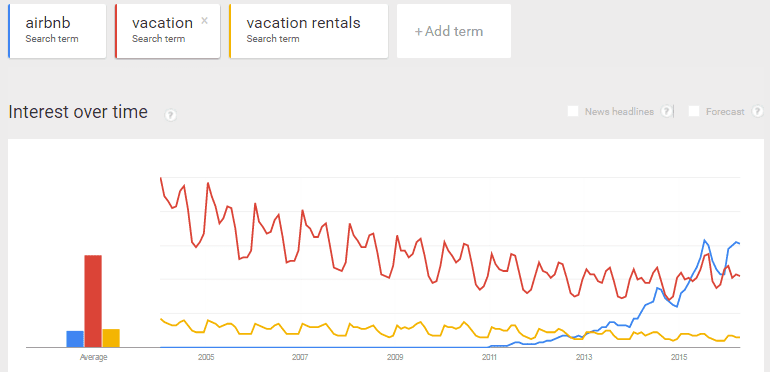
Do you think it is more important for a travel site to rank for vacation rental keywords and locations, or would they prefer people to search for their travel site and the location? Which ends up converting better?
Take this example: fewer and fewer people are searching for vacation or vacation rentals, while Airbnb gets more and more searches.
This proves that as your web presence grows, so will your brand and the searches for your business. Do you think that Airbnb wants to rank more for keywords or have more people searching their brand and locations?
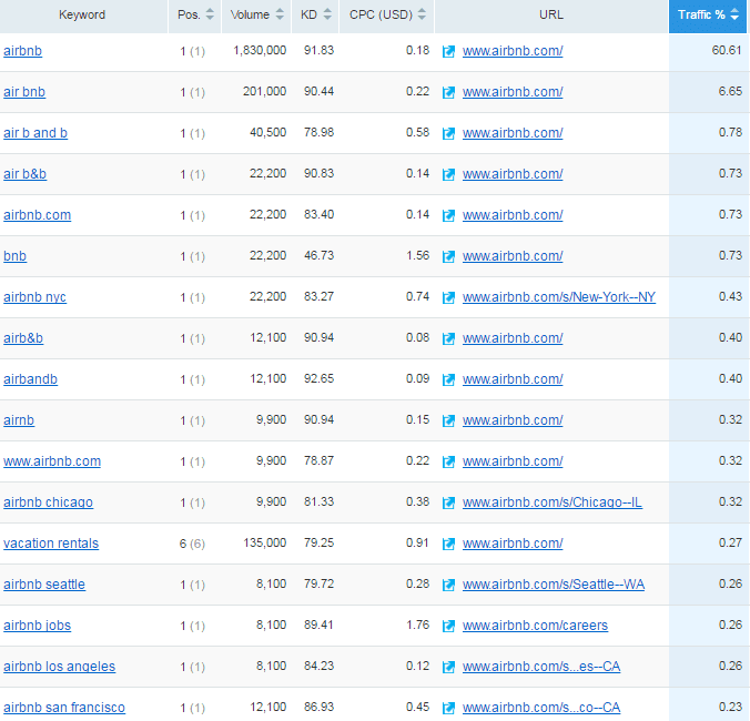
This chart from SEMrush clearly shows that the bulk of their organic traffic is coming from branded searched terms, which definitely have a higher conversion rate.
Your brand or your competition
So do you want consumers to search for your products and services and find you among your competitors? Or do you want consumers to search for your brand and your products and services because they’ve done their research on your company – and you provided what they needed with a strong web presence? Need help? Talk with our website design company in Lancaster. We can help with SEO marketing, email marketing, as well as website design.


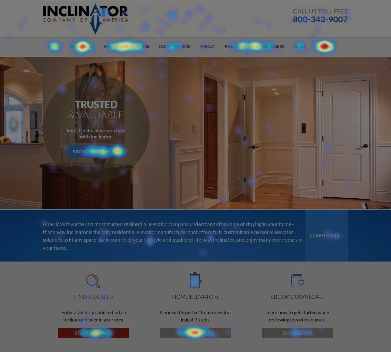 One of the most useful data gathering and aggregating tools is called a “heatmap.” A heatmap shows how visitors interact with a webpage: where they look, what they click on, and how they scroll. The red or “hot” areas of the map represent the greatest amount of activity.
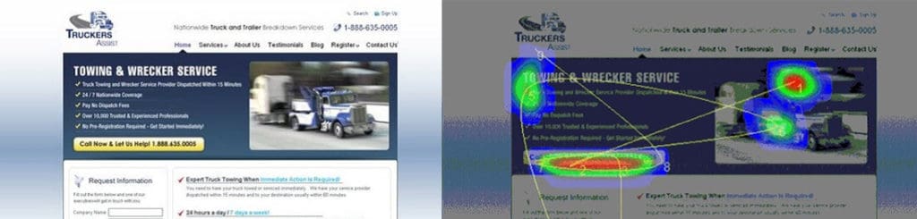


 comScore
 NetMarketShare